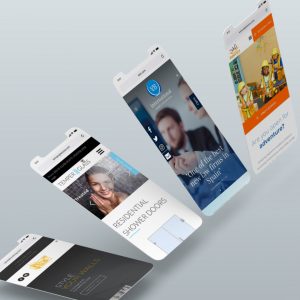
There’s a trend among websites today toward wordlessness. Or at least minimalism. Some of the most successful companies are cutting the big blocks of text on their websites and replacing them with images, colors, or simply visual tones.
It’s in response to the marketplace. People today don’t have as much time as they used to. So they are less likely to read deep into the paragraphs of text you post on your website. Plus, most people are looking at the web on their phones, which have smaller screens that make it practically impossible to read blocks of text, even if they were inclined to do so in the first place.
Less Is More
At Lytron Web Design, we can help you attract more customers by giving them less text. Instead, we can collaborate with you to find ways to bring delight and engagement with people through colors, design, graphs, photos, illustrations, animations, and other images that instantly engage with people on an emotional level.
Nobody reads text anymore. At least that’s the thinking among web designers today. And the facts bear it out. Today, people are more likely to click away from dense, complicated websites with a lot of words and linger longer on websites that have instant and emotional visual appeal.
Lytron Web Design
To remain competitive, your business has to stay engaged with what your customers want. And today that’s less verbiage and more images and art. At Lytron Web Design, we have the experience, resources, knowledge, and tools to bring your business website to life by offering less.
When people see your newly designed website that features genuinely engaging images and art, they will stay longer, buy more, and build stronger loyalty bonds with your business. You can rely on the professionals at Lytron Web Design to deliver results.


No comment yet, add your voice below!