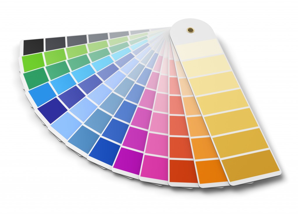
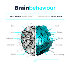
Visitors to your website, blog or other pages respond to what they see on an emotional level first and an intellectual level second. Much of the tone of your web content has to do with the choice of colors that you use.
When you make poor color choices, your conversions will be immediately impacted. For example, if your website is about bounce houses and you choose to use blacks, greys, and other depressing colors, people will naturally want to click off your page.
But if you choose bright, primary colors that appeal to people with children, your conversions will be higher organically.
Determine Your Audience
The first consideration in color choices is your intended audience. Are you seeking to appeal to men or women? Rich people or middle class? Children or adults? The answers to all of these questions can affect your conversions.
For example, women tend to prefer blue, purple and green and naturally avoid grey, orange and brown. Men prefer blue, green and black and don’t like purple, orange and brown.
Using Color to Improve Conversions – Cultivating Trust
When people visit your web pages, you want them to believe in you and trust what you are telling them. Blue is one of the most frequently used colors because it naturally instills trust. That’s why so many corporate logos — including IBM, Paypal, Facebook and others — use shades of blue.
The biggest exception to using blue is food. From an evolutionary perspective, blue is associated subconciously with poison. So try not to use shades of blue when writing about or promoting food-related subjects.
Using Color to Improve Conversions – Calls to Action = Bright Colors
When you get to the part of your web page in which you want the visitor to do something – such as sign up for a newsletter, buy a product, or whatever else your Call to Action (CTA) is — that’s the time to use brighter primary colors.
Just make sure they don’t clash with the other colors on your web page.


