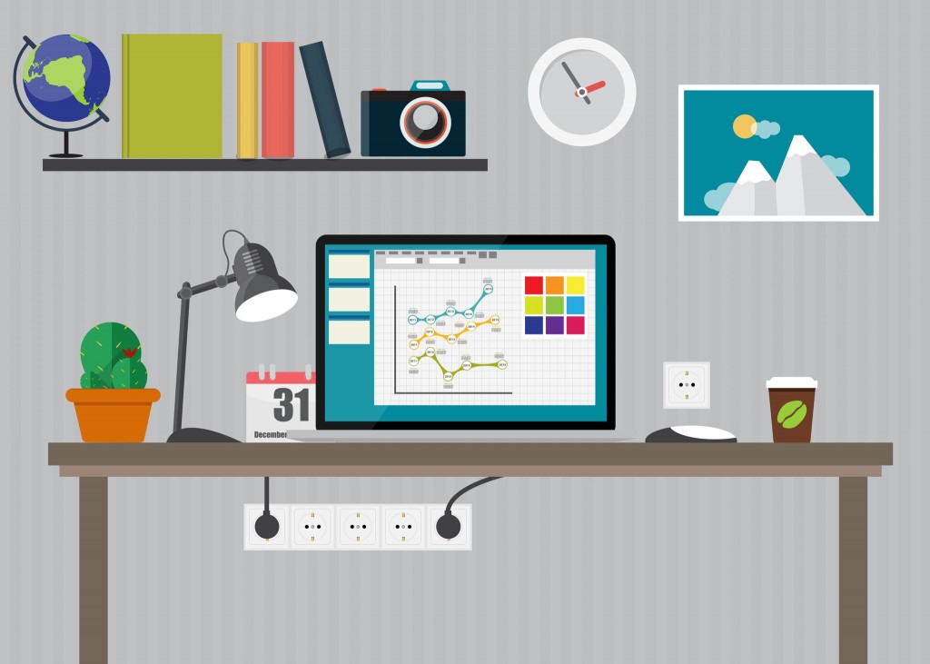
PowerPoint Pitfalls to Avoid During Your Next Presentation

Web Design Company in Fort Lauderdale 1

PowerPoint has become ubiquitous in business presentations. Whether your are pitching an website upgrade to an existing client or trying to attract a new client, you probably depend on this easy to produce, effective tool to get your message across.


But PowerPoint slideshows can actually hurt your credibility if you don’t use them effectively. PowerPoint should be a tool to improve your visuals, not a distraction.


PowerPoint Pitfalls


Here, then, are some top mistakes to avoid when making your next PowerPoint presentation.


  • Take It Easy with the Sound Effects — When PowerPoint was first introduced more than a decade ago, the stock sound effects were a novelty. Today, they are a distraction, especially when the same sound effect is included with every slide transition or when trite sound effects are used, such as clapping at the end. Your want the people watching your presentation to focus on your message, not on the technology.


  • Standard Clipart Is Cliched — PowerPoint is now used so often that the standard clipart that comes with it has become stale and cliched. Depending on it shows a lack of creativity. A better idea is to scan your own photos or choose more original graphics from one of many online companies. Or consider whether you need graphical images at all. Screen captures often add more realism when making a presentation about a website or software.


  • Pre-Made PowerPoint Templates — Many of the templates the come with PowerPoint are outdated. They often include distracting backgrounds or stale color combinations. Come up with your own distinctive look or incorporate your company logo in the corner of the screen.


  • Too Much Text — Slides shouldn’t simply be scripts of what you are reading. They should depict your idea graphically or summarize key points. Avoid slides that contain full paragraphs, quotations or even full sentences. Bullet points work well. Images and graphics work even better.


  • Be Prepared for Disaster — Anticipate the worst and hope for the best. Have a backup plan — such as pass-outs or a flip chart — ready just in case your PowerPoint doesn’t work for whatever reason.

Great Keywords Make Your Websites Easier to Find

Landing Pages

One of the most common ways for people today to find the products and services they want is to search Google. But how does Google know which websites to lead them toward? Keywords.


What are Keywords ?


Are the words and phrases that Internet users type into search engines like Google and Bing. They also are the words search engine algorithms look for when they scan web pages that tells them what the sites are all about.


Placing the most important keywords for your business in the right places on your website can exponentially improve the chances of your pages appearing on the front page or top spot of Google searches when prospective customers are searching online for the types of products and services you offer.


Where Keywords Should Be Placed


So where should you place the best keywords for your business?


  • The most important place is in the page’s the title tag. The first 64 characters of the title tag are shown as the click-through link on Google search result pages.


  • Your keywords also should appear in the meta description tags, which are what describes the page’s content. Keep meta descriptions less than 160 characters.


  • The H1 tag is the page’s header. You should have only one H1 tag per page. The header needs to both describe the page and appeal to the page visitor.


  • Your keywords or keyword phrase should appear at least once near the top of the page’s content, as well as anywhere it makes sense. Try to get your keywords in at least four to five times per page, but no more than that or it will seem like you are “keyword stuffing” the page.


  • Alt tags are the floating descriptions that appear when you place your cursor over an image. Use your keywords in the alt text of an image and also in the image file name.

Top Tips for Using Images to Increase Your Site’s Conversion Rate

Web design 1

The right images not only bring life to your web pages, they also can make them convert better. People don’t want to simply browse a website. They also want to experience it. When you use the best images, you can boost your site’s conversions and connect better with your target audience.


But there are still plenty of  websites that seem oblivious to the importance of images when it comes to getting the most out of their existing traffic. Here, then, are some top techniques for boosting your conversion rate by being smart about the types of images you use on your web pages:


People Are Ruled by Their Emotions — Most people make a buy decision because they are having an emotional experience. If you can find a way to make your page visitors fee just right, they will take action. Use positive images to bring out positive emotions. These can include such things as a pretty girl smiling or an image that makes people feel warm and fuzzy inside.


The people who land on your pages aren’t dumb. They know what you’re trying to convey with your images. But if you can make them feel happy, proud, wanted or draw out some other positive emotion with your images, they will connect with your web pages and are more likely to follow your call to action.


People Like Cute Mascots — Have you ever wondered why so many companies continue to use cute and cuddly mascots for decades after they were first introduced? It’s because they work. People connect with mascots, so if you include a site mascot on your page, it can be an excellent opportunity to reinforce your branding. Mascots help sites create a powerful image in their audience’s mind. They also are highly memorable.


Mascots can help solidify your marketing motif. They also make it much easier to create the desired emotional effect you want on your web pages. Characters and site mascots act as a type of emotional shorthand that visitors can immediately grasp and hold on to.


The Human Touch – Boost your website’s conversion rate by including human faces on your pages. Images of real people cause your visitors to focus more on your page, drawing them towards a common point of interest.


Validate Your Products — TV commercials are an effective way to get people to buy products because they usually show models, actors or real life people using the product itself. When people are praising products, loving them, going crazy over the, it validates the product in the mind of the viewer.


People want to feel safe before buying anything. They have a built-in need to be convinced that they are making the right decision when they buy. And they fear being wrong. When they see other people being pleased with a particular product, it reinforces the idea that this is something they want and need.


Keep the Focus on Them, Not You — Your customers are interested in themselves. They don’t necessarily care about your product or company. It’s the “me” factor that ultimately can lead to conversions. Show your visitors they are smart to choose your products. Make them feel comfortable with high-quality images. Provide the experience that they arrived on your page to feel. This will open up doors to get more people to convert when they arrive on your pages.

Tax Deductions Tips for Small Businesses

Web design 1

Whether you own a web design firm or another type of small business, every penny counts. So it’s always a good idea to get the most out of your business and not give any of your hard-earned profits to the taxman unless you absolutely have to.


When you file your business taxes this year, keep these four potential tax deductions in mind:


  • Write Off Your Expenses — Business expenses include things like office supplies, equipment furniture, business meeting meals and other things. But the tools you use to promote your business are also considered to be expenses. Don’t think something is too small to matter, either.


  • Little things can quickly add up. These include such expenses as ATM credit card and other fees that are charged to your business or bank account, Internet charges, and even classes, seminars and other educational tools you attended in the past year to benefit your business.


  • Your Employees’ Expenses Are Your Expenses, Too — If you reimbursed your employees for such things as gas, meals, hotel charges, travel expenses and other out of pocket expenses, these are considered expenses to your business and can be claimed on your taxes. Make sure you have an “accountable plan” that shows exactly why these reimbursed expenses were business related. Plus, you will need to keep important backup documentation such as receipts in case the IRS wants to see them later.


  • Your Can  Deduct a Home Office — Do you run your web design or other small business out of your home? Then you may be able to claim a deduction on your taxes. Not every home office will qualify and there are strict guidelines that regulate which deductions are kosher and which will attract the attention of IRS auditors. But as long as you play by the rules, you could save yourself a big chunk of change when you pay your business taxes.


  • Bad Debt Expense Can Be Written Off — If you have uncollected invoices or products you shipped or delivered that your clients’ somehow never paid for, you may be able to claim these bad debt expenses on your business taxes by deducting the cost that you should have been paid from your taxes.


Get the Help You Need 


One word of warning: Tax rules can be very complicated and they can change substantially from year to year. If you aren’t experienced at doing your business’s taxes, it’s probably a good idea to leave it to a professional accountant or tax preparer. Usually, they can tell you right away (and accurately) whether something you want to claim as a deduction is legit or not. Plus, they may have further suggestions that you never thought about.


There are also a surprising number of high-quality yet affordable web-based software programs you can use that include the most up to date information about tax code. Typically, you can use these programs to do your business’ taxes online in just a few short hours.


Whichever route you choose, the money you spend in hiring a professional tax preparer or paying an online software service to help you with your taxes is usually money well spent. Not only can it help you find every penny you are entitled to, but it can keep you from getting in trouble with the IRS.

Top Web Design Elements for 2015

Results

It’s a new year, so it’s time to review some of the top web design features that can make your web pages more unique, more attractive and and fresher in 2015.


While it’s not necessary to use each of these cutting edge design elements on every page, by mixing and matching them in different combinations, you can create memorable pages that truly jump out at page visitors:


1. Unique Fonts


Most websites use whatever default font setting is on their dashboard. But you can really make your pages look interesting by choosing modern-looking fonts that are cool and stylish. Just make sure they aren’t so extreme that they make it difficult to read your content.


While choosing a great looking font can improve your web design, once you find a cool font you like, it’s a good idea to stick with it throughout your content. Mixing together too many different fonts on the same page can be jarring and may cause page visitors to click off of your pages more quickly.


2. 3-D Is Out


Using too many three-dimensional effects can make a web page look phony and dated. Instead, go for a flat design look for your web design. Flat design uses simple illustrations that usually have bright, primary colors.


Flat design is appealing because it offers a minimalist look that draws attention to your content, rather than to the cleverness of your web design. It also can make your pages look clean and slick.


Modern looking pages have more white space, compared to older web pages which tended to cram as much as possible into every possible corner of the web page. Today’s web users appreciate simplicity.


Top Web Design Elements for 2015 – 3. Hover Effects Are Back In


For a while there, every web designer avoided hover effects like the plague. But now they are back in vogue among the cool kids.


Hover effects change the color of what you are looking at when you place your cursor over a part of a website. This draws your page visitor’s attention to what you want them to see. Plus, it’s a cool effect that can enhance the user’s experience. Unlike pop-up boxes, hover effects aren’t intrusive. But they can help the visitor keep track of where they are looking on a page.


Top Web Design Elements for 2015 – 4.  BIG Product Images  


While product images have always been a big part of promotional pages, modern web pages tend to have big product images. How big? Close to novelty sized.


Big product images serve a dual purpose: They fill up a lot of space with an attractive image of whatever you are trying to promote. Plus, they allow page visitors to get a detailed look that they couldn’t get from a tiny thumbnail image or a smaller image.


In addition to the primary image, you also can include big images that highlight details you want your page visitors to see more closely.


Including the most up-to-date web design elements on your web pages can make them look modern and appealing to your page visitors so they will keep coming back again and again.

10 Winter Web Design Tips to Warm Your Web Pages

New High Tech Tools Help Target Terrorists

Collection Photo Share Email Thumb?Link Token=Dbjnejlb3Fotvpn&Amp;Collection Gid Dbase64=Lp Zdvdymlkaaaaaaaag6QThe holidays are finally past and much of the country is settling in for another long, cold winter.


That makes it a great time to bring warm, sunny images to your web pages to make them seem brighter and more cheery for visitors who land on them. Here then are 10 web design tips for warming up your web pages:


1. Don’t Go Overboard — While you want to use warm, fuzzy colors such as orange and yellows during the winter months, don’t go too far. Background colors should be soothing, not glaring.


2. Spread Your Text Around — Don’t bunch your text up in the center of the page, in the margins or in another concentrated area. Spread it around the page to make your web design seem more relaxed and less cluttered.


3. Keep It Short — Visitors aren’t going to read dense blocks of text. Instead, use short, punchy sentences or bullet points to get your message across in as few words as possible.


4. No Motion — Avoid the temptation to add motion of moving GIFs on your web pages. These will only distract your visitors and prevent them from absorbing the warm overall mood you are trying to create.


5. Not Sure? Drop it! — If you aren’t sure why you are including something on your web page — an image, text or something else — it probably doesn’t belong there. Drop it like it’s hot!


6. Don’t Forget the Contact Information — A big mistake many web designers make is to forget to include contact information. If visitors have no way to reach you, it’s a web page FAIL!


7. Avoid Graphics That Aren’t Universal — Visitors to your page will use different equipment to view it. So make sure your graphics are accessible to everyone regardless of their browser.


8. Visit Your Own Websites — Check out your site from different browsers to see how it looks. Colors may look different, images may not be viewable, or other mistakes can be caught.


9. Avoid Blue Text — Don’t use blue as a text color because most visitors  will assume it’s a link.


10. Sparse is Best — Winter lends itself to sparse, wide open spaces. Reflect the season by leaving more open space on your web pages during winter months.

Holidays Offer New Opportunities for Your Web Design

hollidays

Roundabout

The holidays are a special time. Stores and homes are decorated with brightly colored lights. Holiday decorations are hung and displayed both indoors and out. And holiday music fills the air.


Why should web design be left out of the holiday celebrations?


Whether you are working with your own web pages or somebody else’s, the holidays offer a special opportunity to spruce up your pages with special holiday themes and decor that can make them appear more lively and better engage page visitors by adding a little holiday spirit.


Here, then, are some helpful tips on sprucing up your web design with a little holiday cheer:


  • Add Holiday Images, Descriptions to Your Content — Look for special holiday themes you can use just during the holidays. Include photos, illustrations and images that include beloved holiday designs, such as Christmas trees, angels, ornaments, Santa Claus, elves and other fun and engaging things.


  • Feature Special Holiday Products and Categories — Promote products and product categories that are related to the holidays. For many online retailers, for example, the holidays are the busiest time of they year. Consider offering special pricing, free shipping or other promotions for the holidays.


  • Participate in New Holiday Retail Traditions — Black Friday, Cyber Monday, Giving Tuesday and other new retail traditions offer you a special opportunity to add value to the retail experience. Feature specialized web design for each of these events to attract new customers and reward loyal ones.


  • Leverage Social Media — You can promote your special holiday web pages that feature your holiday web design on your social media accounts. Encourage your social media contacts, customers and others to “Like” your pages and help promote your business so that it can go viral and make yours a truly special holiday this year!


  • Create Special Holiday Landing Pages — Use your web design to direct page visitors to special holiday landing pages. Here you can offer special holiday greetings, make special offers, and other holiday-related promotions.


While the rest of the world is celebrating the holidays, there’s no reason why your web design shouldn’t do the same. Use these helpful tips to make your holidays special and rewarding.

Using a Photo Editor Program To Make Your Images Better

SMART

Pictures really do say a thousand words. So including the right images on your web pages can make all the difference between capturing your page visitor’s attention and having them click off to another site.


The photos you use need to get the message you are trying to express across to the viewer as quickly and effectively as possible. So you shouldn’t just copy and paste a photo onto your web page and hope for the best.


Top photography Editor Programs 


Instead, use a photo editor program such as Microsoft Office, Windows Photo Viewer, Paint, or Photoshop to make your pictures look stunning. Many of these programs come free when you buy bundled software packages, such as Microsoft Office Suite. Others you may have to buy independently.


Most of the photo editor tools are extremely simple to use and don’t require a lot of training or expertise. In fact, most people can figure out how to master them on their own in just a few minutes.


Crop Your photography


The first photo editor tool you should use to improve a photo is the “Crop” function. This allows you to move the frame of the photo wherever you want it to be so that you can remove any boring open spaces and concentrate the eye of the viewer only on what you want them to see.


Some photo editor programs come with an “Auto Correct” button. This lets you automatically improve the colors, balance the blacks and whites, and otherwise improve the way your picture looks instantly.


No More Red Eyes


Red eye removal is another easy to use function included with most photo editor programs. It enables you to salvage photos that otherwise might be ruined by the red eye effect caused by some flash cameras.


With the free or affordable tools available to the beginner or novice web design enthusiast today, it’s easy to make your web pages look great and capture the imagination of your page visitors.

The 5 Biggest Web Design Mistakes to Avoid

Tips for Naming Your Website

When it comes to web design Fort Lauderdale business owners want most, there is a right way to design your pages and a wrong way.


Here are the top 5 most common web design blunders many website creators make:


1. Not Being User Friendly — Customers land on your pages for a reason. If you don’t make it fast, simple and easy for them to get what they came for, they will quickly click off and go somewhere else.


2. Making It Too Easy to Navigate Away from Your Site — The goal of any successful web design is to keep the visitor on the page for as long as possible. If the links on your pages take your visitors to other websites, rather than opening in a new browser window, they may never find their way back to your page.


3.  Being Overly Cutting Edge — Visitors appreciate innovation and cool design, but they will be turned away if your site is too weird or they can’t inherently figure out how to navigate their way around it. It’s okay to be different, but follow standard design conventions.


4. Looking Too Commercial — Obviously, you want your page visitors to buy your products and services. But if your web page looks too much like a commercial, they will change channels quickly.


5. Being Too Hard to Find — If your page titles don’t include your keywords, if your content isn’t optimized, or if your page isn’t ranked in the top spot (or at least the top half of the front page) for your niche keywords, it’s going to be difficult (or even impossible) for your customers to find your page.


At “Lytron Lead Generation” Boca Raton, we specialize in the high-converting, high visibility web design Fort Lauderdale business owners want most. Call us today and let us help get your business noticed online so that you can expand your Internet profile and improve your business’ online reputation.

How to Get the Best Web Design Available Anywhere

Rewards and Recognition Keep Customers Coming Back

When it comes to the effective web design, getting your message across in words is only half the battle. Your pages also need to offer images and a “look” that people find interesting enough to stick around to read your content.


Unless you have a degree in graphic design or years of experience with web design and programming code, you probably are going to have to depend on somebody else for this skill.


While there are plenty of places to go online where you can use pre-made templates for your web pages, you have to remember that many — if not most — of your competitors in the marketplace are using those same open source sites to design their pages.


Unique Solutions to Specific Problems


If you want to be unique, you should think about bringing in an expert to create your buttons, banners, eCovers and other design elements that are going to set your pages apart.


That’s where “Lytron Lead Generation” Boca Raton comes into play. While there are plenty of highly skilled people who can provide you with what you need on a piece-by-piece basis, we provide you with the kind of affordable web design business owners want most, while still giving you complete control over the overall look of your pages.


The Power of  Video


We also can create interesting and informative videos for your site. This is a good idea because an increasing number of people searching for products and services online now prefer watching videos over reading written content. Even Google has gotten into the act, giving higher page rankings to video-based pages.


Plus, right now the demand for video content is higher than the supply, so when you allow “Lytron Lead Generation” Boca Raton to create great videos for you now, you can capture a larger share of whatever niche market you are working in.


Simply the Best!


The bottom lines is this: If you want the finest web design available anywhere, then you need “Lytron Lead Generation” Boca Raton.


We’re simply the best!